
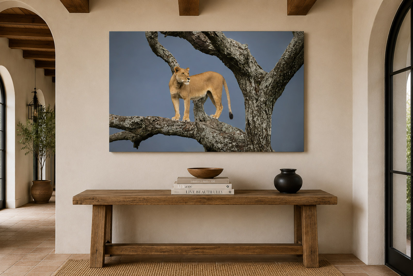
Choose a photograph that spans about two-thirds of your sofa or main wall, hang it with the center 57 to 60 inches from the floor, and match the print medium to the light in the room. Then choose the image you would still want to look at in ten years. Everything else is refinement.
The living room is the hardest room in the house to hang art in, because it is the room people actually live in. It has the most light, the most furniture, the most competing attention, and the most guests. It is also the room where a single well-chosen photograph does more work than anywhere else in the home.
Here is how I walk collectors through the decision.
Start with the wall, not the photograph
Almost everyone does this backward. They fall in love with an image first, buy it in whatever size feels affordable, hang it, and then spend the next year quietly aware that something is off. What is off is almost always scale.
Measure the wall before you look at a single picture. Write down the width of the wall, the width of the sofa or console beneath it, the ceiling height, and the distance from which you will usually see the piece.
Then decide on the shape of the installation. One large statement photograph is the strongest choice in a living room, and the one I recommend most often. A pair or a triptych works well over a long sofa or a sectional. A salon-style grouping is beautiful but demanding — it needs a unifying thread, and in a busy room it often reads as clutter rather than collection.
How big should the print be?
A single photograph should span roughly two-thirds to three-quarters of the furniture below it.
- 72-inch sofa → 48 to 54 inches wide
- 84-inch sofa → 56 to 63 inches wide
- 96-inch sofa → 64 to 72 inches wide
- Bare wall, no furniture → 60 to 75 percent of the wall's width
In a living room you typically view art from eight to twelve feet away — considerably farther than in a hallway or bedroom. That distance supports scale, and it is why prints that felt enormous on a screen so often feel modest once they are on the wall.
If your ceilings are vaulted or the wall runs tall and narrow, orient vertically rather than trying to fill a tall wall with a horizontal image floating in space.
The reliable way to settle this is to see it. I offer a room visualization service: send a straight-on photograph of your wall with a rough measurement, and I will render the piece to scale in your actual room, in the medium you are considering. Most people size up by one increment after they see it.
What height should it hang?
Center the photograph 57 to 60 inches from the floor. That is standard gallery eye level, and it is right in nearly every case.
Two adjustments:
- Above a sofa: leave 8 to 10 inches between the top of the sofa back and the bottom edge of the piece. More than that and the art floats free of the furniture; less and it feels crowded.
- Above a mantel: leave 4 to 12 inches above the mantel shelf. If you have a working fireplace, keep in mind that sustained heat and soot are hard on any artwork, and a frameless mounted piece will fare better than paper under glass.
If seating is low and lounge-oriented, drop the center slightly. Hang for the height at which people will actually be sitting.
Which print medium is right for a living room?
Light is the deciding factor, more than style. Walk into the room at the hour you use it most and look at the wall. If you can see windows or lamps reflected there, that reflection will land on your photograph too.
Lumachrome HD TruLife Acrylic — a photographic print face-mounted to anti-reflective acrylic. Virtually glare-free, with the deepest blacks and the most luminous sense of depth of any medium I offer. This is what I recommend for bright rooms, west-facing walls, and any wall that sits opposite windows. It is also the most dimensional, so it carries large-scale work beautifully.
ChromaLuxe Metal — the image infused into the surface of an aluminum panel. Vivid, high-contrast, and extremely durable, with a slight sheen. It suits contemporary and transitional interiors, holds up in humid or high-traffic rooms, and wipes clean with a soft cloth. No glass, no frame, no yellowing.
DuraPlaq® FloatPlaqs — the print mounted to a rigid substrate with a recessed float back, so the piece stands off the wall without a frame. Warmer and quieter than metal or acrylic, with a matte surface that absorbs light instead of returning it. It sits especially well in western, rustic, and lodge interiors, and in rooms with a lot of wood and texture.
Fine art paper — the most traditional presentation, and the most tactile. Framed and matted to your specification. Collectors who come from a print-collecting background often prefer it, and it is the right answer in a formal or historically furnished room.
There is more detail on surfaces, sizes, framing, and care on the Selecting Prints page.
How do I choose the subject?
The living room is a shared room, so choose for the mood you want the room to hold, not just for the image you find most striking on a screen.
Landscape and seascape work as a kind of window — they open the room up, give the eye somewhere to travel, and hold a space calm. They are the safest choice in a room where people gather to talk. See the Landscape & Seascapecollection.
Equine photographs bring warmth, movement, and a living presence into a room. They read as personal in a way pure landscape does not, and they carry extraordinarily well at large scale. See the Equine collection.
Western and cowboy imagery brings narrative and character. These images invite the question who is that, and where is this — which makes them wonderful in a room where people sit and talk, and less suited to a room you want entirely serene. See the Cowboys & Western collection.
Wildlife photographs make a strong focal statement. A single wildlife image can anchor an entire room, and animals photographed with dignity rather than drama age far better on a wall. See the Wildlife collection.
One test worth applying to any image: does it reward a second look? A photograph with a long attention span reveals something at year three that you did not notice in week one. A photograph that shouts is exciting for a month and invisible after that.
How do I match the photograph to my color palette?
Harmonize, do not match. Art chosen to match a throw pillow will be wrong the moment the pillow is replaced.
Identify the dominant temperature of your room — warm or cool — and choose an image that shares it. Then let one color in the photograph pick up something already present in the space: the leather of a chair, the grey of a stone hearth, the blue of a rug.
As a rule, neutral rooms can carry saturated, high-contrast photographs, and rooms already busy with pattern and color are better served by quieter, more tonal work. If you are unsure, tonal wins. Understated photography grows on a room; loud photography wears on it.
Does the limited edition matter?
Every photograph I release is an edition of 50 worldwide, signed and numbered, across all sizes and mediums combined. That number is fixed and it does not expand.
I would not encourage anyone to buy a photograph primarily as an investment. Buy it because you want to live with it. What the edition does is guarantee that the image will not be reproduced endlessly, that what hangs on your wall is a defined and documented object, and that its provenance is clear if it is ever appraised, insured, or passed on. That matters — but it should be the second reason you buy, not the first.
Prices range from $450 for smaller works to $10,000 for major large-format installations.
Should I bring in my interior designer?
If you are working with a designer, bring them in early — before you choose the image, not after. Designers think about a wall in the context of an entire room, and they will catch scale and sightline issues that are hard to see from inside your own house.
I work directly with interior designers, art consultants, and hospitality procurement teams through my Fine Art Trade Program, which offers an ongoing 20 percent trade discount and 30 percent on orders of ten pieces or more, along with room visualization, custom sizing, and coordinated installation support.
A simple order of operations
- Measure the wall, the furniture below it, and your usual viewing distance.
- Note the light — where it comes from, and at what hour you use the room.
- Choose the medium that suits that light.
- Choose the image you want to live with, not the one that impresses fastest.
- See it rendered in your room to scale before you commit.
- Order, and hang it at 57 to 60 inches on center.
Choosing art for a living room is not really a design problem. It is a question of what you want the room to feel like, and what you want to be looking at while your life happens in front of it. Get the scale and the medium right, and then trust the image that keeps pulling you back.
If you would like help choosing, or want to see a particular photograph rendered on your own wall, get in touch — I am glad to work through it with you.